MY ROLE
Creative Direction ←
Graphic Design ←
Website Design ←
Typography ←
Product Photography ←
Identity ←
Brand Positioning ←
Packaging Design ←
Content Creation ←
Editorial Design ←
STORY
METHODS | CHALLENGE | APPROACH
THE CHALLENGE
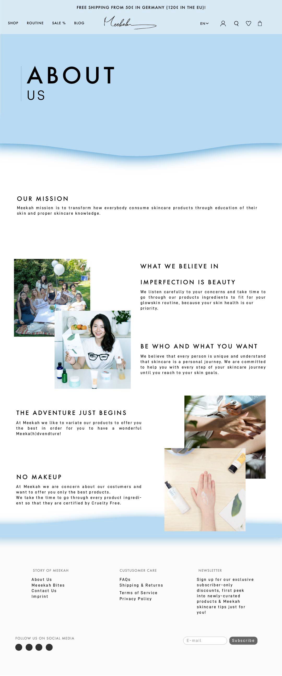
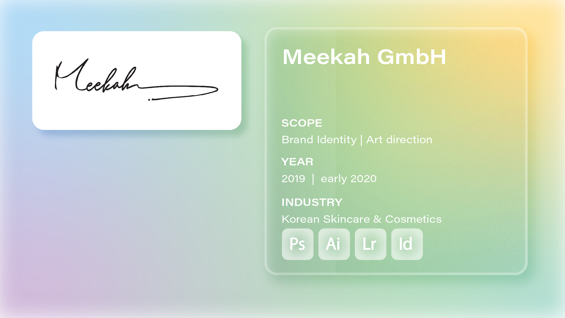
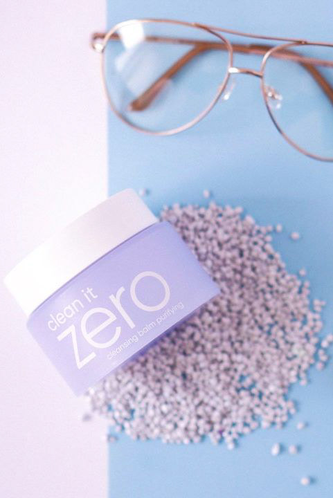
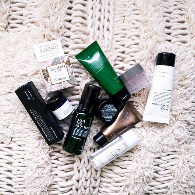
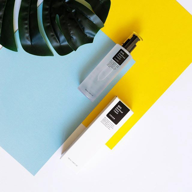
I defined the brand identity and visual guidelines for a Munich startup pioneering Korean skincare in Germany. By blending minimalist Korean aesthetics with modern European styling, I established a clean digital presence that successfully connected with local consumers.
THE APPROACH
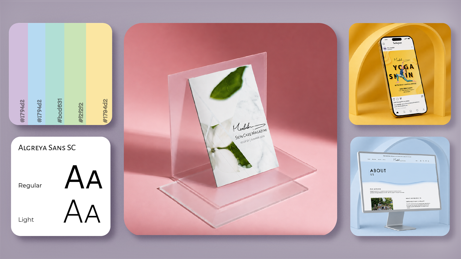
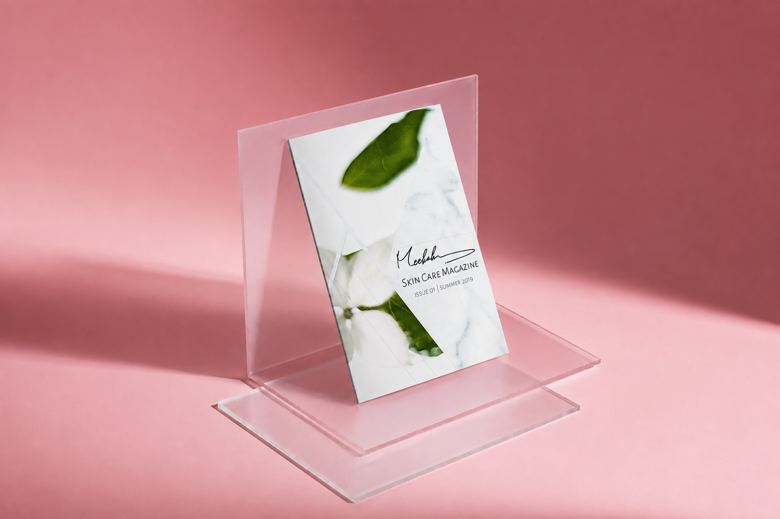
I built a complete visual identity and brand system from the ground up, blending minimalist Korean balance with structured European typography into a spatial, organic aesthetic. From designing the e-commerce website and high-end packaging to leading social content, print collateral, and a curated brand magazine, I created a seamless, continuous experience across every digital and physical touchpoint.
MOODBOARD
VISUAL DIRECTION
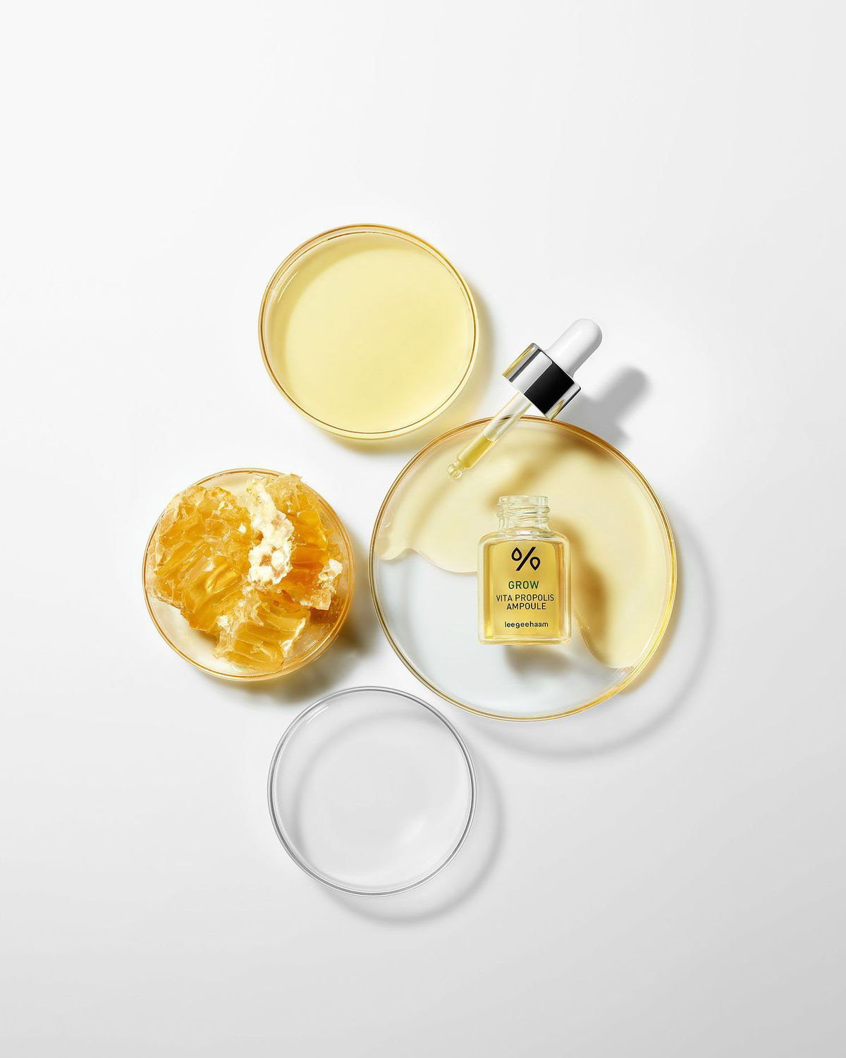
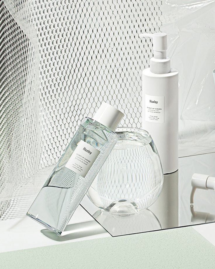
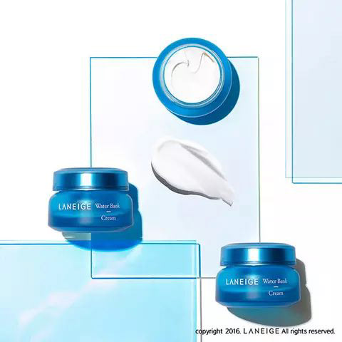
THE CHERRY BLOSSOM OF KOREA
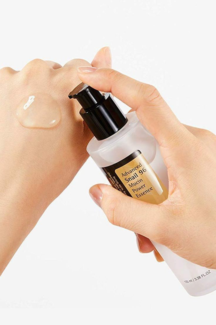
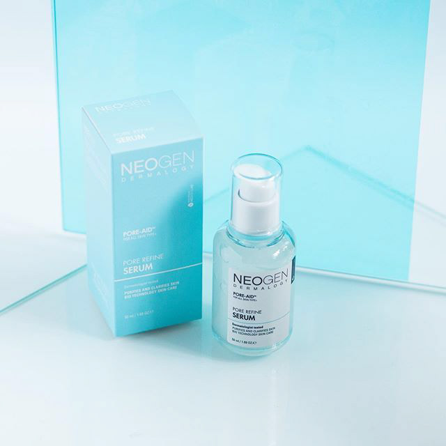
I grounded the moodboard and brand identity in the soft palettes of Korean cherry blossoms, pairing them with a clean, glossy aesthetic that mirrors the products' skincare benefits. To highlight K-beauty's reliance on natural ingredients like ginseng and snail mucin, I integrated fluid, organic shapes throughout the visual system. Breaking away from the flat design trends of 2019, I directed the digital and social content toward a highly spatial approach, utilizing 3D-inspired photography and lighting to give the brand a modern, tactile depth.
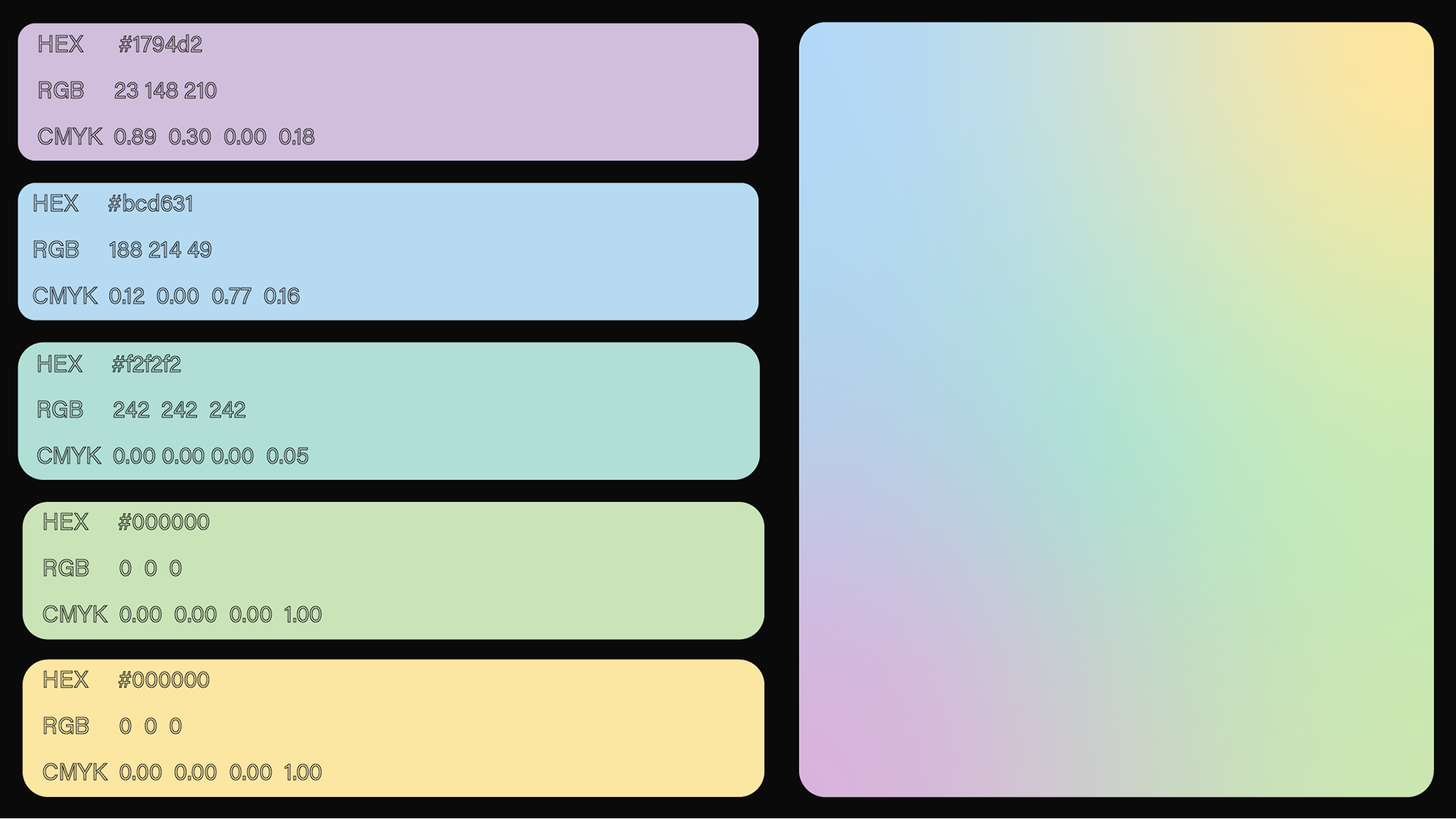
PALETTE
COLLECTION | SELECTION
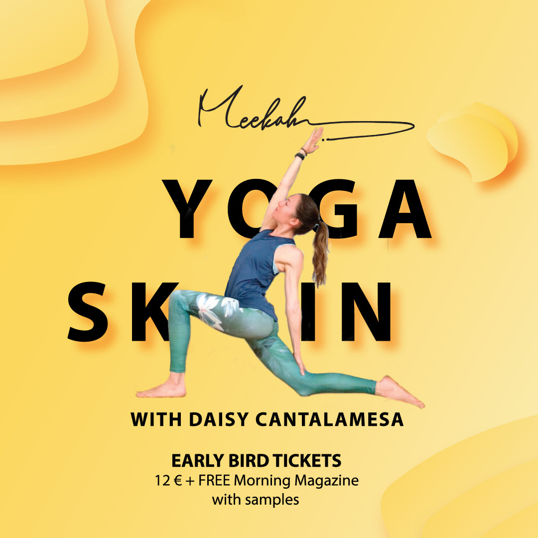
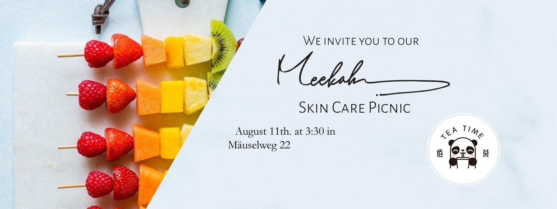
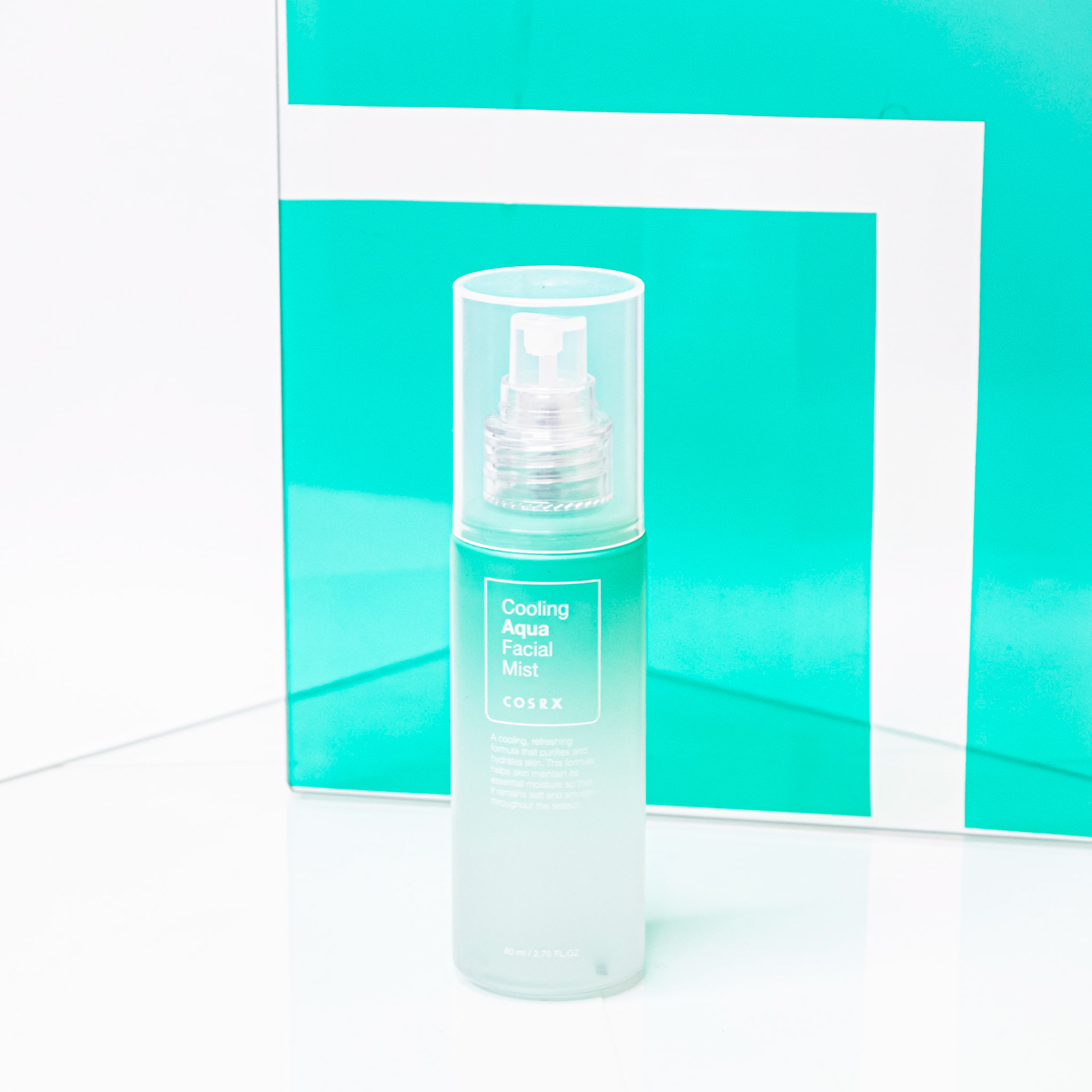
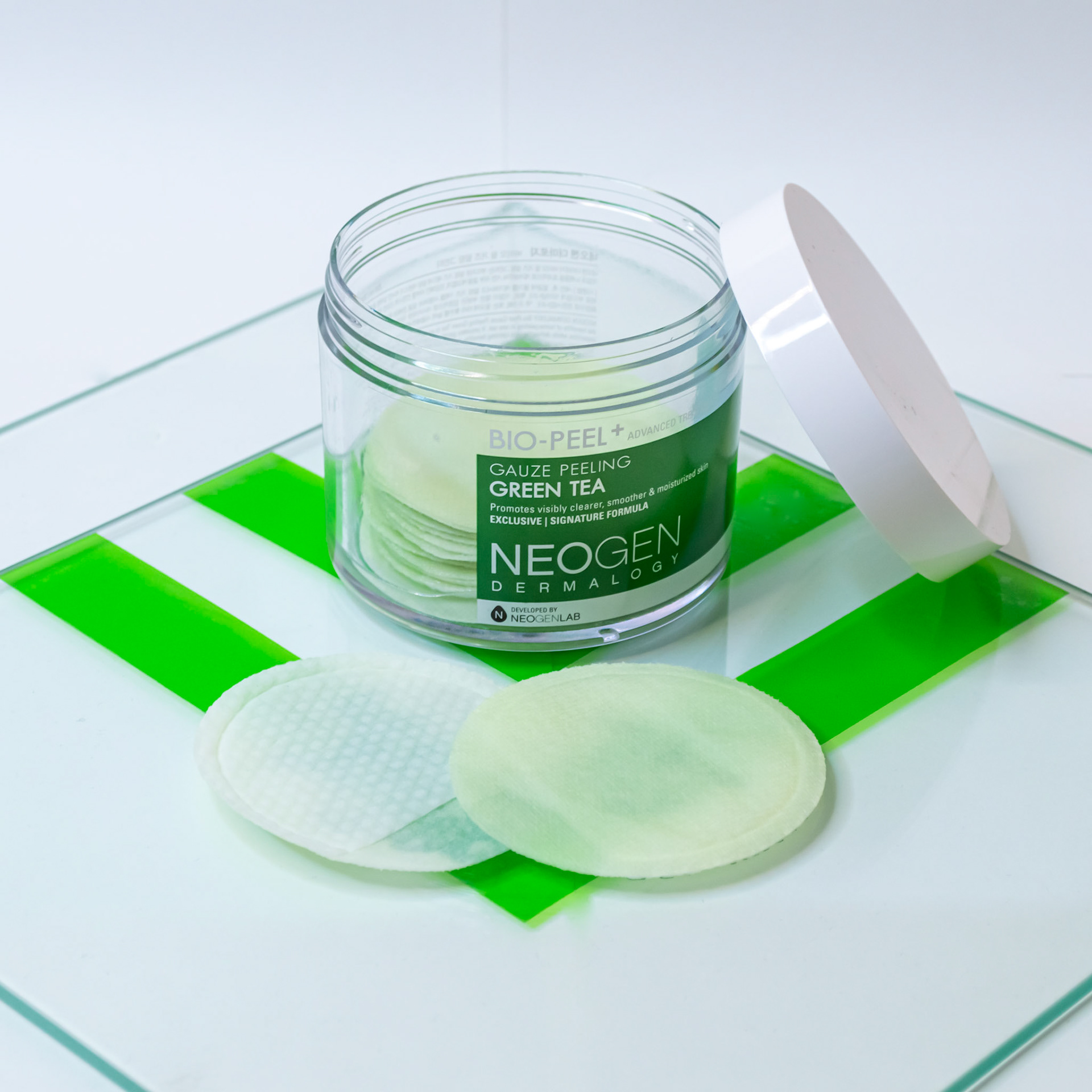
SOCIAL MEDIA
VISUALS | OUTPUT

EDITORIAL DESIGN
VISUALS | OUTPUT
DIGITAL SERVICES
USER EXPERIENCE | USER INTERFACE | USABILITY